

Key Takeaways
What Layering Actually Means in Interior Design
A room can be fully furnished and still feel flat. The sofa is there, the coffee table is there, the curtains hang correctly — and yet something is missing. What's missing is almost always layering: the deliberate stacking of visual, tactile, and tonal elements that give a room its sense of completeness and warmth.
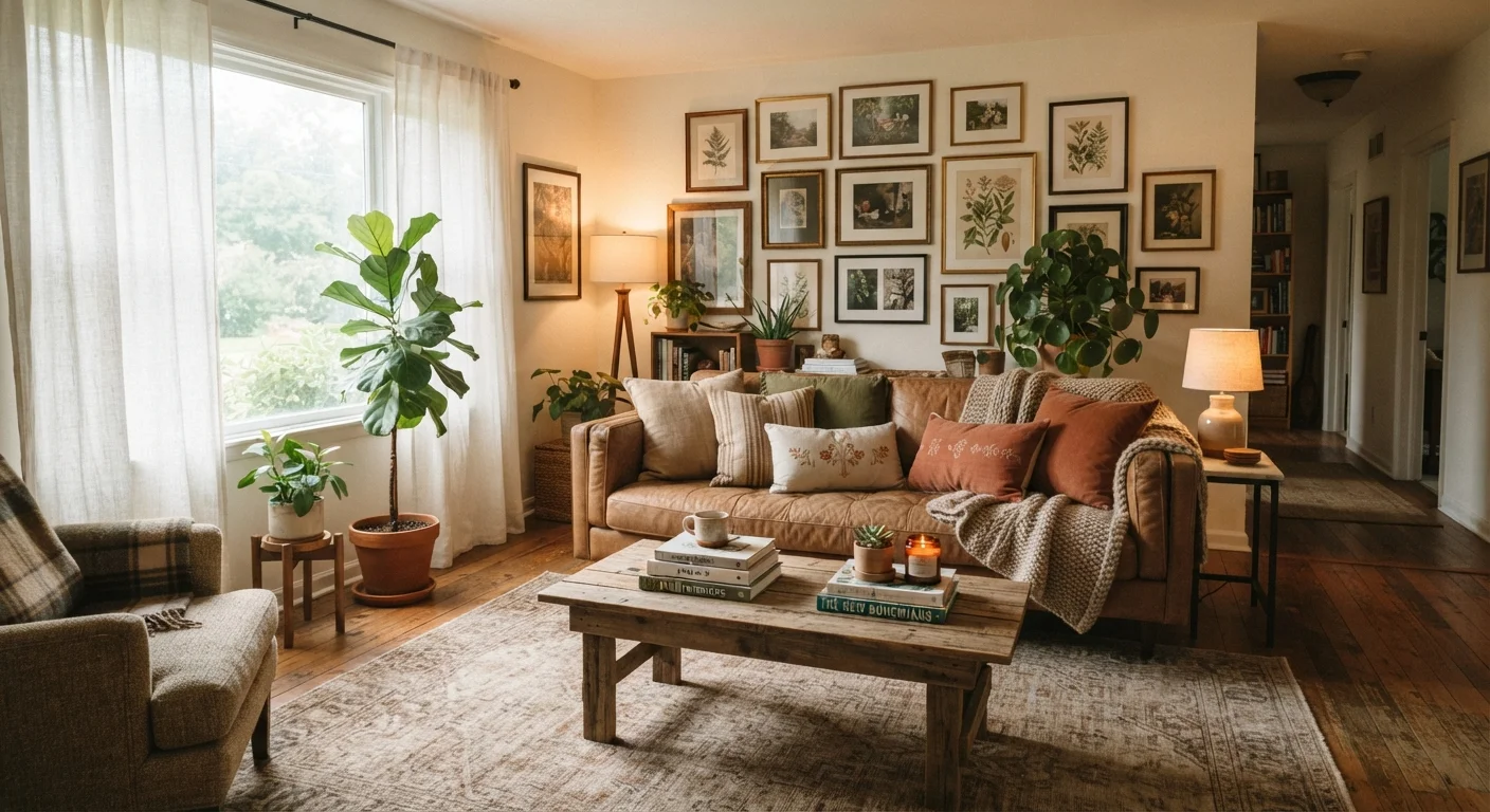
Interior designers think of a room as a composition built in stages. The architecture and major furniture pieces form the skeleton. Rugs, lighting, and window treatments add structure and atmosphere. Pillows, throws, art, and objects are the final layers that create personality and depth. Remove any tier and the room reads as unfinished — add too much of one thing without the others, and it reads as cluttered rather than composed.
The good news: layering is not about budget. It's a methodology. A room with secondhand furniture and thoughtfully placed candles, stacked books, and a well-chosen rug can feel richer than a showroom filled with expensive pieces arranged without intention. Understanding the system is what matters. See how common decorating myths often get in the way of this kind of composed thinking.
Start With Lighting: The Foundation of Depth
Lighting does more than illuminate a room — it creates shadow, drama, and dimension. A room lit only by a single overhead fixture will always look flat, regardless of what else is in it. Professional designers consistently plan lighting in three tiers.
- Ambient lighting provides overall illumination — ceiling fixtures, recessed lights, or chandeliers.
- Task lighting serves a specific function — reading lamps, under-cabinet lighting, pendants over a work surface.
- Accent lighting creates visual interest — a picture light over art, an uplighter behind a plant, a small lamp on a bookshelf.
The interplay between these three creates pools of light and shadow that make a room feel three-dimensional. Dimmers are one of the highest-value investments in any room — they allow you to shift the atmosphere entirely without changing a single piece of furniture.
Natural light deserves equal attention. Sheer curtains that filter rather than block daylight keep a room feeling airy while softening harsh afternoon sun. For a fuller picture of how light sources interact with color and texture, our guide on natural versus artificial lighting covers the decisions worth making early.
When in doubt about lighting placement, plug in a lamp before committing to any fixed fixture. Live with the light source in different positions for a few days to see where it naturally improves the room.
Lighting decisions are difficult to reverse once wired in. Testing with portable lamps first reveals how shadow and warmth actually move through a specific space at different times of day.
Before purchasing a rug, tape out its footprint on the floor with painter's tape. Sit in your usual spots and assess whether the proportions feel right before spending a dollar.
Rug size is the most commonly misjudged element in residential decorating. Visualizing the actual footprint eliminates the most frequent and expensive sizing mistakes.
Rugs and Textiles: Ground the Room and Soften It
An area rug is often the single most transformative element in a room — and the most frequently undersized. A rug that's too small floats like an island in the middle of a space, disconnecting the furniture from the floor and making the room feel larger in the wrong way. As a general guideline, in a seating area all front legs of the major furniture pieces should sit on the rug, or the rug should be large enough for all legs to rest fully on it.
Beyond the rug, textiles layered across a room — throw pillows in varied fabrics, a folded blanket draped over a chair arm, linen curtains that pool slightly at the floor — soften hard edges and introduce tactile richness. Mixing textures within a single color family (think a chunky knit, a smooth velvet, and a linen weave, all in warm neutrals) creates visual depth without visual noise. Texture is the element most rooms are missing, and textiles are the most accessible way to introduce it.
Color, Pattern, and the Art of Visual Interest
Color layering works on a principle of repetition. When a hue appears in only one place — say, a single blue pillow — it looks like an accident. When that same blue appears in three places (a pillow, a vase, a piece of art), it reads as a deliberate choice that ties the room together. Designers call this the rule of three, and it applies to pattern repetition as well.
Pattern mixing is less intimidating than it sounds. The key is varying scale: combine a large-scale pattern (a bold geometric rug) with a medium-scale one (a printed pillow) and a small-scale or textural one (a woven throw). Keeping the color palette consistent across patterns prevents the room from feeling chaotic.
Walls are another tool. A single accent wall in a deeper tone can add significant depth without overwhelming a room — though placement and finish matter enormously. Our piece on when accent walls work and when they backfire walks through when that choice pays off.
Avoid Layering Only One Tone
A common mistake is layering within a single tone family — all neutrals, all whites — without any contrast anchor. While cohesive, these rooms often feel washed out rather than composed. Introduce at least one deeper value through a rug, a piece of art, or an accent object to give the eye somewhere to rest.
Objects, Art, and the Finishing Touches That Make It Personal
This is where layering becomes personal. Objects — books, ceramics, plants, collected pieces, framed art — are what transform a designed room into a lived-in one. The principles that guide their arrangement are straightforward:
- Vary height. Group objects at different heights to create visual movement. A tall vase next to a low stack of books next to a mid-height candle is more interesting than three items at the same level.
- Use odd numbers. Groups of three or five tend to feel more natural and dynamic than pairs (though pairs work well in symmetrical arrangements like flanking a fireplace).
- Connect through material or tone. Objects that share a finish — matte black, natural wood, aged brass — feel curated rather than random even if their shapes differ completely.
Art placement follows similar logic. Hanging a piece too high is one of the most common mistakes; the center of the artwork should generally sit at eye level, around 57–60 inches from the floor. Gallery walls benefit from a unifying element — consistent frame finish, consistent mat color, or a shared subject matter — to read as intentional rather than accumulated. Understanding scale and proportion will sharpen every object and art placement decision you make.
Pulling All the Layers Together
The most layered rooms work because they achieve a balance of contrast. Smooth surfaces sit beside rough ones. A large, low-profile sofa anchors the space while a tall floor lamp draws the eye upward. Light tones are grounded by deeper ones. This principle of contrast is what creates depth — not adding more stuff, but adding strategically different stuff.
A useful editing exercise: step back and squint at a finished room. You should be able to see a range of light and dark values distributed throughout the space, not clustered in one corner. If the room reads as one flat tone, it needs more contrast. If it looks busy, something needs to be removed or simplified.
Start small if you're working from scratch. Nail the lighting first. Add a properly sized rug. Build up textiles one piece at a time. Introduce objects last. Each layer you add with intention moves the room closer to that composed, finished quality that professional interiors share — regardless of the budget behind them. For rooms where size feels like a constraint, many of these techniques apply directly in our guide on making a small room feel bigger.