

Key Takeaways
Texture in Interior Design
Texture refers to the surface quality of materials in a room — whether something feels rough or smooth, soft or hard, matte or glossy. In decorating, texture is used deliberately to add visual depth and tactile interest that color and furniture placement alone cannot provide. It's the difference between a room that looks flat in photos and one that feels layered and alive in person.
Designers distinguish between actual texture (physically felt, like a nubby wool pillow) and visual texture (perceived through pattern or light, like the grain in printed wallpaper). Both affect how a room reads.
Why Texture Is the Missing Layer in Most Rooms
Most decorating conversations start with paint color or furniture layout — and those choices matter. But they rarely explain why a room that looks reasonable on paper still feels somehow flat or forgettable in person. More often than not, the missing element is texture.
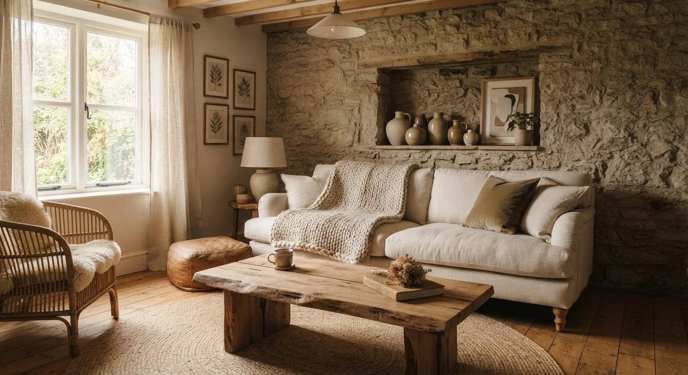
Texture is what gives a room sensory richness. It's the slight roughness of a linen curtain catching afternoon light, the visual weight of a chunky knit draped over an armchair, the contrast between a smooth marble tabletop and the raw wood shelf beside it. When these surface contrasts are absent, rooms tend to read as one-dimensional — even if the color palette is thoughtfully chosen and the furniture is well-placed.
This connects to a broader truth about layered decorating, explored in detail in how interior designers build depth in any space. Texture is one of the foundational tools designers use to make rooms feel complete.
3+
Distinct surface types recommended per room
Interior design professionals commonly cite a minimum of three contrasting texture types as the baseline for a room that reads as layered and complete.
~70%
Of homeowners cite 'warmth' as a top decorating goal
Surveys of American homeowners consistently show warmth and comfort as primary decorating priorities — both are closely linked to tactile and visual texture, not color alone.
The Core Texture Categories and How to Use Them
Not all textures work the same way, and understanding a few basic categories helps you make more intentional choices.
- Soft textures — wool, linen, velvet, cotton, and knits — signal warmth and comfort. They absorb light rather than reflecting it, which makes a room feel quieter and more intimate. These are your throws, upholstered cushions, curtains, and rugs.
- Hard textures — stone, ceramic, glass, and polished metals — introduce contrast and a sense of permanence. A ceramic lamp base beside a soft sofa, or a stone trivet on a wooden table, anchors softer materials and keeps them from feeling fussy.
- Natural and woven textures — jute, rattan, wicker, raw wood, and bamboo — occupy a middle ground. They're tactile without being heavy, and they work well across a wide range of decorating styles, from coastal to contemporary.
A practical baseline used by many interior designers is to aim for at least three contrasting surface types in any given room. The exact mix depends on your style and the room's function, but variety is the operative word.
Common Texture Mistakes and How to Avoid Them
The most frequent mistake isn't using too much texture — it's using too much of the same texture. A room furnished entirely in smooth, matte surfaces will feel sterile. But a room stacked with rough, nubby, and woven elements without relief can feel overwhelming. The goal is contrast and pacing.
A second common mistake is treating texture as an afterthought. When every purchase decision is driven by color or shape, texture ends up accidental rather than intentional. It helps to check yourself during decorating decisions: "What surface quality does this bring, and does it contrast with what's already here?"
If your room currently feels off but you can't pinpoint why, texture imbalance may be part of the answer. Our article on why rooms feel off even after decorating covers several related culprits worth examining together.
Start With One Textural Anchor
If you're new to thinking about texture, pick one statement piece — a large area rug with visible weave, a boucle armchair, or a reclaimed wood shelf — and build outward from there. It's easier to add contrast to a single strong textural anchor than to try to layer texture across an entire room at once. This approach also helps you spend thoughtfully rather than buying multiple smaller items that don't cohesively add up.
Easy Ways to Layer Texture Without Starting Over
Adding texture doesn't require a renovation or a large budget. The most accessible entry points are textiles — swap flat, smooth cushion covers for something woven or bouclé, add a jute or wool rug over an existing floor, or drape a textured throw where the room currently has none.
Beyond textiles, consider natural materials like a wooden tray, a terracotta pot, a wicker basket for storage, or a bundle of dried botanicals. These items introduce tactile contrast quietly and inexpensively.
Wall surfaces are often overlooked. A single wall treated with limewash paint, beadboard, or a wood slat panel introduces visual and physical texture without a full renovation. If you're weighing a feature wall approach, accent walls and when they work is a useful companion read.
Finally, lighting placement can amplify texture significantly. A lamp positioned to cast light at an angle across a woven wall hanging or rough plaster surface will reveal dimension that overhead lighting hides completely. Working with your room's light sources — both natural and artificial — is worth understanding as part of any texture strategy.