

Key Takeaways
Where Decorating Rules Come From — and Why They Break Down
Most decorating "rules" started as reasonable heuristics — shorthand advice to help beginners avoid obvious missteps. Over time, they hardened into absolutes, passed along in magazines and social media captions until they felt like design law. The problem is that rooms are deeply individual: different proportions, light conditions, and personal preferences make blanket rules unreliable guides.
Understanding why a guideline exists is far more useful than following it blindly. Once you know the reasoning, you can decide when the rule applies to your space and when it's actually working against you. The myths below are among the most persistent — and the most likely to be keeping your rooms looking flat, predictable, or unfinished.
For a broader look at why a decorated room can still feel wrong, see why your room feels "off" even after decorating.
Myth
You should never mix metals — brass, chrome, and black iron belong in separate rooms.
Fact
Mixing metal finishes is a well-established design technique when done with intention and a shared tonal anchor.
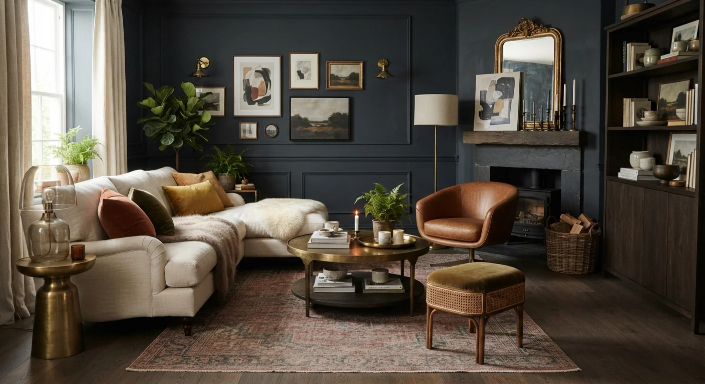
The "never mix metals" rule likely emerged from a time when matching sets dominated retail furniture. In practice, professional designers routinely combine finishes — pairing warm brass with matte black, or brushed nickel with aged bronze — because contrast creates visual interest. The key is choosing metals that share a quality: similar warmth (gold, brass, copper together) or similar coolness (chrome, silver, gunmetal). One finish should dominate, with the others appearing as accents. Without any mixing, a room can feel monotonous rather than cohesive.
Myth
Dark rooms need light-colored walls to look bigger and brighter.
Fact
Dark wall colors can make a low-light room feel intentionally intimate and rich, rather than simply dim.
Light walls in a dark room don't create the brightness many people expect — they tend to highlight the room's shadows by contrast, making the lack of natural light more obvious. Deep tones like forest green, navy, or charcoal absorb that unevenness and make the space feel cocooned and deliberate. This approach, sometimes called "going dark," works especially well in dining rooms, studies, and bedrooms where atmosphere matters more than perceived square footage. Understanding how undertones and light sources interact is covered in more depth in color theory for home decorating.
Myth
Furniture should be pushed against the walls to maximize floor space.
Fact
Floating furniture away from walls typically makes a room feel larger and more livable, not more cramped.
Lining every piece of furniture against the perimeter of a room leaves a hollow center that reads as empty rather than open. Interior designers almost universally recommend pulling seating inward to create a defined conversation zone. The visual weight of furniture actually anchors the room and draws the eye across the full space. The perception of spaciousness comes from good sight lines and purposeful groupings — not from hugging walls. Even moving a sofa 6–8 inches off a wall can immediately change how a room reads.
Myth
A rug should be small enough to fit entirely within the furniture grouping.
Fact
Most designers recommend rugs large enough for at least the front legs of every major furniture piece to rest on.
An undersized rug is one of the most reliable ways to make an otherwise well-furnished room feel disjointed and flat. When a rug floats in the center of a seating area with all furniture legs off it, nothing feels anchored — the rug reads as a random element rather than a foundation. Sizing up means the rug visually unifies the grouping, defines the zone, and adds the layered, grounded quality that makes rooms feel finished. In living rooms, an 8×10 or 9×12 is often the right starting point where a 5×8 might seem adequate on paper.
Myth
A matching furniture suite creates a polished, cohesive look.
Fact
Rooms furnished entirely from a single matching set often feel flat and showroom-like rather than composed and personal.
Matching sets eliminate the contrast and tension that make a room visually engaging. When every piece shares the same wood tone, leg style, and finish, there's nothing for the eye to move between. A more effective approach is to establish a unifying principle — a shared scale, a consistent wood tone, a limited palette — and then vary individual pieces within that framework. A sofa in a different upholstery, a side table in a contrasting material, or a chair with a distinct silhouette all contribute to a room that feels curated rather than purchased in one trip. See scale and proportion for guidance on keeping variety from tipping into chaos.
Myth
Wall art should be hung as high as possible to draw the eye upward.
Fact
Art hung too high is among the most cited décor mistakes — eye-level placement (roughly 57–60 inches to center) is the standard professional benchmark.
The instinct to hang art high often comes from wanting to fill vertical space or make ceilings feel taller. What it usually produces instead is art that feels disconnected from the furniture beneath it, requiring viewers to crane their necks. The 57-to-60-inch-to-center guideline used by many galleries reflects natural sightlines for a standing adult. Over a sofa or sideboard, art should hang 6–8 inches above the furniture's top edge so the two elements read as related. For detailed placement guidance, see wall art placement.
Putting the Corrections to Work in Your Space
Debunking a myth is only useful if it changes how you approach a room. A few practical starting points:
- Test dark paint on large swatches before committing. A 12-by-12-inch sample on the actual wall, viewed in both daylight and evening light, tells you far more than a paint chip. For guidance on working with your room's specific light source, see decorating around natural and artificial light.
- Pull furniture away from walls by at least a few inches — even in a small room. Counterintuitively, this often makes the space feel larger and more intentional. More strategies are covered in making a small room feel bigger.
- Audit your rug size by taping out its dimensions on the floor before purchasing. In most seating areas, at least the front legs of every major piece of furniture should sit on the rug.
- Introduce one mixed-metal element — a lamp, a mirror frame, a cabinet pull — and live with it for a week before deciding whether to expand the approach.
57–60"
Standard art hanging height (center to floor)
This benchmark is widely used by galleries and interior designers to align art with natural adult sightlines.
8×10 ft
Most common under-sized rug upgrade in living rooms
Design professionals frequently recommend sizing up from a 5×8 to an 8×10 as one of the highest-impact single changes in a living room.
Building depth into a room takes more than fixing individual elements — it requires thinking about how layers work together. The layered room approach explains how lighting, textiles, color, and objects combine into something that feels fully composed rather than assembled piece by piece. And if texture is absent from your space, that alone can explain why even well-furnished rooms feel flat.
Rules Are Starting Points, Not Finish Lines
Every guideline in decorating exists because it works — in certain rooms, with certain proportions, under certain light conditions. The goal isn't to break rules for the sake of it, but to understand each rule well enough to know when it applies to your specific space and when it doesn't. When a room still feels off after following all the standard advice, that's often a sign a rule is being applied where it doesn't belong.