

Key Takeaways
Why Hanging Height Is the First Thing to Get Right
The single most common wall art mistake in American homes is hanging pieces too high. It's an understandable reflex — blank wall space looms above furniture, and the instinct is to fill it. But the result is art that looks stranded, disconnected from the room and the people in it.
The industry-standard guideline used by most interior designers places the visual center of a piece at 57 to 60 inches from the floor — roughly eye level for a standing adult. That means measuring to the midpoint of the artwork, not to the top of the frame. For a 24-inch-tall piece, the top of the frame would hang at about 69–72 inches, which keeps the art well within the room's sightline without touching the ceiling zone.
This rule holds in most rooms, but it isn't absolute. In spaces where people primarily sit — a reading nook, a dining room, a bedroom — dropping the center point slightly lower, closer to 54–56 inches, can feel more natural and intentional. The goal is that the art meets your gaze, not that it looms over it. Understanding how scale and proportion shape a room will help you calibrate when to adjust this baseline.
Anchoring Art to Furniture Below It
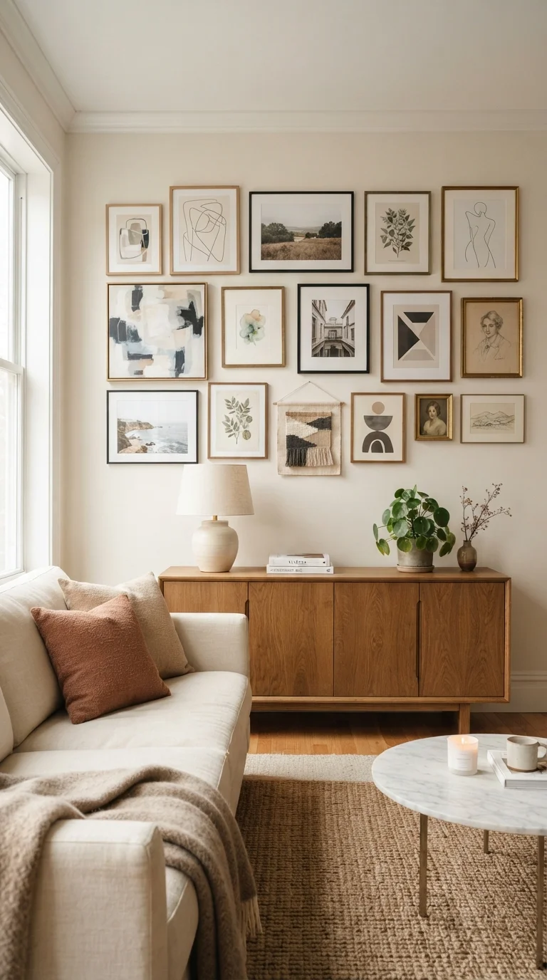
When artwork hangs above a sofa, console table, bed, or sideboard, it needs to feel visually connected to that furniture — not floating in its own separate universe on the wall. The practical guideline here is a gap of 6 to 8 inches between the top of the furniture and the bottom of the frame. Any more than that and the piece drifts; any less and it risks looking cramped.
Width matters just as much as height in this context. A piece or grouping that is too narrow above a wide sofa will look timid and lost. Aim for artwork that spans roughly two-thirds to three-quarters the width of the furniture beneath it. A single large piece works well here, as does a carefully planned horizontal arrangement of two or three smaller frames treated as one unit.
Measure Before You Commit to Any Hook
Before hanging a single piece, measure the distance from the hanging hardware on the back of the frame to the top of the frame. This tells you exactly how far below your marked nail the piece will actually sit — a step many people skip that leads to art hung higher than intended. A simple tape measure and a pencil mark save a lot of patching.
This anchoring principle is especially important in dining rooms, where artwork above a buffet or sideboard sets the tone for the entire space. If your dining wall feels off despite having art on it, measure the gap — a simple rehang is often all it takes.
Planning a Gallery Wall Without Guesswork
A gallery wall done well looks effortless. Done poorly, it looks chaotic. The difference almost always comes down to planning the arrangement before anything touches the wall.
Lay out your full gallery arrangement on the floor before hanging anything.
This allows you to audition different configurations, check overall balance, and identify problem pieces without touching the wall. It removes the guesswork that leads to a wall riddled with unnecessary holes.
Use painter's tape or paper templates on the wall to preview placement before nailing.
Seeing approximate frame shapes on the actual wall surface — in the actual light conditions of the room — reveals spacing and sizing issues that floor layouts can miss.
Keep spacing between grouped frames consistent throughout the arrangement.
Irregular gaps create visual noise that distracts from the art itself. Consistent spacing — even just 2–3 inches — signals intention and makes a mixed-frame grouping feel unified.
Anchor large pieces first and build the grouping outward from them.
Starting with the largest or most visually dominant piece establishes the center of gravity for the arrangement. Smaller frames placed around it feel balanced rather than scattered.
Adjust the standard 57–60 inch rule for the room's primary viewing position.
The guideline is calibrated for a standing viewer, but in rooms where people predominantly sit, art hung at standing eye-level can feel disconnected and too high.
Once you've settled on a layout you like on the floor, transfer it to the wall by tracing each frame onto kraft paper, cutting out the shapes, and taping them up temporarily. This lets you live with the arrangement for a day or two, see how it reads at different times of light, and make adjustments before you commit to nails. It takes an extra hour upfront and saves you from a wall full of patch-and-repaint repairs.
Gallery walls also interact with the room's broader visual layers. If you're working with a bold accent wall, see our look at when accent walls elevate a room and when they backfire before finalizing your placement — the wall color affects how frames read from across the room.
Spacing, Symmetry, and When to Break the Rules
Consistent spacing is what separates a gallery wall that looks curated from one that looks accidental. For most groupings, 2 to 3 inches between frames reads as intentional and cohesive. Larger, bolder pieces can handle 3 to 4 inches. Going beyond that starts to look like separate artworks competing rather than a composed arrangement.
57–60"
Standard eye-level art center height from floor
This benchmark, widely used by interior designers, places artwork within the natural sightline of a standing adult in most residential spaces.
2–4"
Recommended spacing between grouped frames
Design guidelines generally suggest this range for gallery walls to achieve visual cohesion without frames appearing crowded or disconnected.
Symmetrical arrangements — matching frames in a grid or mirror layout — communicate order and formality. They suit traditional rooms, hallways, and spaces where calm and structure are the goal. Asymmetrical groupings, mixing frame sizes and orientations, bring energy and personality. Neither is universally correct; the choice depends on the room's existing character.
One practical caution: rooms with very low ceilings or tall, narrow walls may need to deviate from the standard guidelines to look proportional. A room that already feels small benefits from art placed thoughtfully — see our guide on making a small room feel bigger for techniques that work alongside wall art placement. And if you've been following decorating rules rigidly, some of those rules are more flexible than you think.