

Key Takeaways
Start here
The Color Wheel: Your Starting Point
Build on it
Warm vs. Cool Tones: What They Do to a Room
Go deeper
Complementary, Analogous, and Triadic Schemes
Apply a framework
The 60-30-10 Rule in Plain English
Refine your choices
How Lighting Changes Everything
Take action
Putting It All Together in Your Own Home
The Color Wheel: Your Starting Point
Color theory starts with the color wheel — a circular chart organizing hues into logical relationships. The three primary colors (red, yellow, blue) combine to form secondary colors (orange, green, purple), and blending those creates tertiary colors like red-orange or blue-green.
You don't need to memorize every combination. What the wheel actually gives you is a visual map of which colors will feel harmonious together and which will create contrast. In decorating, both harmony and contrast are useful tools depending on the effect you want.
Hue
The pure form of a color — red, blue, or yellow — before any white, black, or gray is added to it.
Saturation
How vivid or muted a color appears. A highly saturated color is intense and bold; a low-saturation version of the same hue looks washed out or dusty.
Undertone
The subtle secondary color beneath the surface of a paint or fabric — for example, a gray wall that looks faintly purple in certain light. Undertones are why two 'white' paints can look completely different in the same room.
Value
How light or dark a color is. Adding white creates a tint (lighter); adding black creates a shade (darker). Value affects how much a color advances or recedes in a space.
Neutral
Colors like white, gray, beige, and black that don't appear on the color wheel. In decorating, neutrals usually form the dominant 60% of a room's palette because they're easy to live with and flexible.
Warm vs. Cool Tones: What They Do to a Room
Every color leans warm or cool — and so does every shade of white, gray, and beige. Warm tones (reds, oranges, yellows, creamy whites) visually advance, drawing walls inward and creating an intimate, enveloping feeling. Cool tones (blues, greens, grays, pure whites) recede, making a room feel airier and more open.
This has real practical applications. A large, echo-y living room can feel more grounded painted in a warm terracotta. A cramped bedroom can feel more spacious in a soft sage green. Worth noting: the same principle applies to undertones in neutrals — a beige with a pink undertone reads warm, while a beige with a gray undertone reads cool. Choosing the wrong one can make a room feel unintentionally dingy or cold.
If you're curious how undertone logic works beyond paint — it applies to personal style too. See how color combinations work in personal styling for a parallel breakdown.
Complementary, Analogous, and Triadic Schemes
Three color relationships do the most heavy lifting in home decorating:
- Complementary: Colors opposite on the wheel (blue + orange, green + red). High contrast, energetic, and bold. Best used when one color dominates and the other accents — not split 50/50.
- Analogous: Three to five neighboring colors (sage, olive, forest green). Naturally harmonious and calming. Ideal for bedrooms or spaces where you want visual ease.
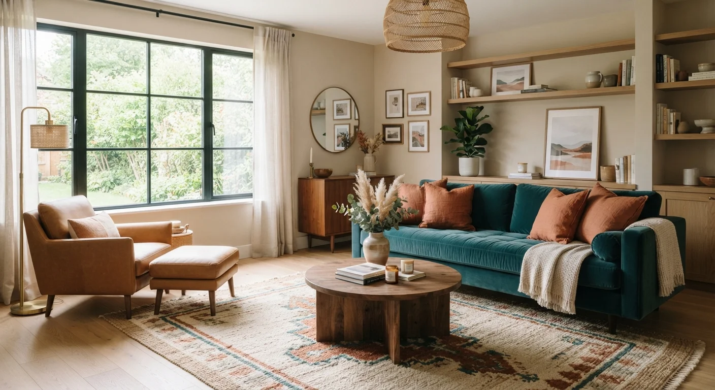
- Triadic: Three colors evenly spaced on the wheel (rust, teal, mustard). Lively without being jarring if the saturation is kept even. Works well in playrooms, kitchens, or rooms where personality is the goal.
Most well-decorated rooms use one of these schemes without the homeowner ever realizing it. Identifying which scheme speaks to you is often the clearest path to a palette you'll actually love living in.
Start With a Fabric Swatch, Not a Paint Chip
Upholstery, rugs, and curtains come in far fewer color options than paint, so build your palette around them first. Once you have a fabric you love, matching wall paint to it is straightforward — just take the swatch to a paint counter. Going in the opposite direction is much harder.
The 60-30-10 Rule in Plain English
The 60-30-10 rule is the single most useful framework for beginners. It divides a room's color into three proportions:
- 60% — Dominant color: Walls, large sofa, or area rug. This color sets the overall mood.
- 30% — Secondary color: Curtains, accent chairs, bedding. It supports and contrasts the dominant color without competing.
- 10% — Accent color: Throw pillows, artwork, vases, lamps. This is where you can be bolder or more playful.
The rule works because it mirrors proportions naturally pleasing to the eye. A common mistake is distributing colors too evenly — giving every shade equal weight creates visual noise. The 10% accent slot is often where a complementary color lives, giving the room a pop of energy without overwhelming it. Once you know the rule, you can also break it intentionally — but the result tends to be more confident when you understand why you're departing from it.
How Lighting Changes Everything
A paint chip at the hardware store and that same color on your north-facing wall are two entirely different experiences. Lighting — both natural and artificial — shifts color dramatically. North-facing rooms receive cool, indirect light that amplifies grays and blues and can make warm tones look muddy. South-facing rooms flood with warm light that enriches almost any palette.
Artificial light adds another layer: incandescent and warm LED bulbs push yellows and reds; cool-white LEDs flatten warm colors. Test paint swatches on your actual walls at multiple times of day before committing to a gallon.
For a deeper look at how to work around your room's specific light conditions, read our guide to decorating around natural and artificial lighting.
Putting It All Together in Your Own Home
Start with what you already own. A sofa, a rug, or a piece of art you love can anchor your entire palette. Pull two or three colors from that anchor piece and build your 60-30-10 split around them. Identify whether your room's fixed elements (flooring, tile, cabinetry) lean warm or cool, and choose paint that doesn't fight that undertone.
If you're starting a room from scratch, pick your dominant color first — then find your secondary and accent. Resist buying anything until those three are settled.
Color is only one layer of a room's personality. Once your palette feels solid, explore decorating styles to understand how texture, scale, and furniture shapes pull the whole picture together.